
considerations. While privacy, light control, and durability matter, aesthetics often play a bigger role in home design decisions. Choosing curtains or window blinds that complement your interior colour scheme can significantly improve the overall harmony and cohesiveness of your space.
Discover a practical guide for homeowners and designers looking to make informed decisions when coordinating blinds with interior tones.
Understand the Base Colour Palette of Your Interior
Start by assessing the dominant colours already present in your space. This assessment includes your wall paint, flooring, furniture upholstery, cabinetry, and built-in features. Common themes in Singaporean HDBs and condominiums include neutral tones such as white, beige, taupe, and grey, along with occasional accent walls. Determining whether you want your curtain blinds to be a focal point or blend in seamlessly is essential. Match the blinds to the dominant or secondary wall tone if subtlety is the goal. However, if you want contrast, opt for complementary or accent shades.
Use Neutral Blinds for Versatility
Neutral-toned curtain blinds are often the safest choice for homeowners who expect to change their furniture or wall colours in the near future. Shades such as white, cream, grey, and light brown work well in most modern interiors and allow flexibility in future redesigns. These colours also reflect the city-state’s preference for minimalist and Scandinavian-inspired interiors. Window blinds featuring wood-like finishes or soft greys are especially popular in open-concept living areas and bedrooms.
Match or Complement Furniture Tones
Your blinds should not visually clash with major furniture pieces such as sofas, bed frames, or dining sets. Light blinds in similar undertones (cool or warm) help maintain cohesion for interiors with light-coloured furniture. Meanwhile, for darker furniture, you can either contrast with light blinds to break the heaviness or match the tone to deepen the look. Fabric curtain blinds often offer more visual softness, while Venetian or roller window blinds are better suited for a clean, uniform appearance.
Consider Natural Light and Room Function
Lighting conditions affect how colours appear. North-facing rooms receive indirect light, which can make cool-toned blinds look dull. Consider warmer-coloured blinds in these rooms to counterbalance the lack of natural warmth. Meanwhile, for south-facing rooms that get more sun, cool or muted tones prevent excessive glare. Bedrooms often benefit from blackout curtain blinds in deeper hues, while kitchens and bathrooms are better suited for light-coloured, moisture-resistant window blinds in Singapore.
Coordinate Patterns and Textures Carefully
Patterned curtain blinds are best used in rooms with otherwise minimal decoration. Stick to solid-coloured blinds if your walls or upholstery already feature bold prints or textures. Conversely, in minimalist rooms, blinds with subtle patterns or weaves can add visual interest. Texture is equally important; linen-look blinds provide a softer appearance, while PVC or aluminium window blinds are more suitable for modern, industrial spaces.
Think Long-Term and Practical
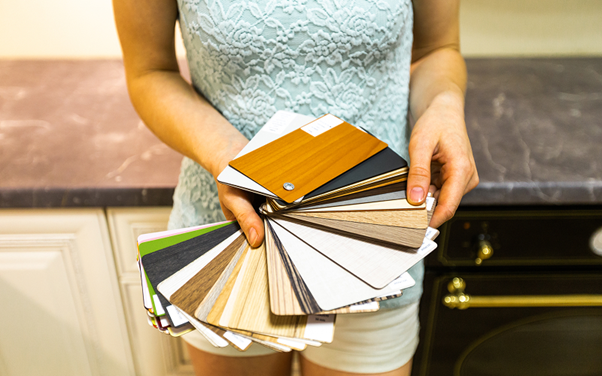
Avoid overly trendy colours unless you are prepared to replace blinds often. Soft, earthy tones and muted pastels remain popular in the region’s interior design market because they age well and remain in style across seasons. Remember, when choosing coloured curtain blinds, also check how the fabric looks against daylight and artificial light to avoid surprises after installation. Samples and fabric swatches can help you test colours at home before making a final decision.
Conclusion
Matching curtain blinds in Singapore with your interior colour palette is a balance of aesthetics, function, and long-term appeal. Understanding your base colours, light exposure, and texture coordination will help you make better decisions for each room. Whether opting for fabric or structured window blinds, selecting the right colour ensures the final result complements rather than competes with your existing design.
Contact De Art Studio to work with professionals who understand local interiors and can recommend products tailored to your palette and layout.